


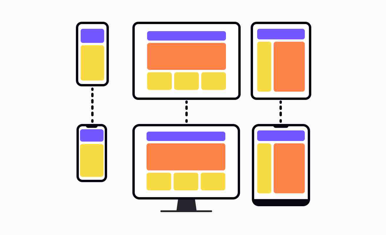
Adaptive design is an approach to web and software development which is focused on creating applications that can be used and viewed on any device or platform, including desktop computers, tablets, mobile phones, and other web-enabled devices. This method of design involves the creation of applications which can be viewed equally well on a range of devices, regardless of size, resolution, or operating system.
Adaptive design often utilizes technologies such as HTML5, CSS3, JavaScript, and AJAX to create an experience that is tailored to the device being used, by adjusting the application’s layout, features, and navigation. Rather than creating multiple versions of an application for each device, adaptive design creates an inherently responsive interface which can be used seamlessly across platforms.
In addition to being able to be used across devices, adaptive design also enables developers to create applications that can be updated without requiring users to download a new version of the application; instead any changes made are automatically detected and applied in the background. This approach helps to ensure that users always have the latest version of a given application, without needing to manually download and install an update.
Adaptive design is seen as a benefit to both developers and users, providing advantages such as reducing the development time required to create applications that will be used on multiple devices, improving the user experience, and providing a more efficient way of keeping applications up-to-date.